


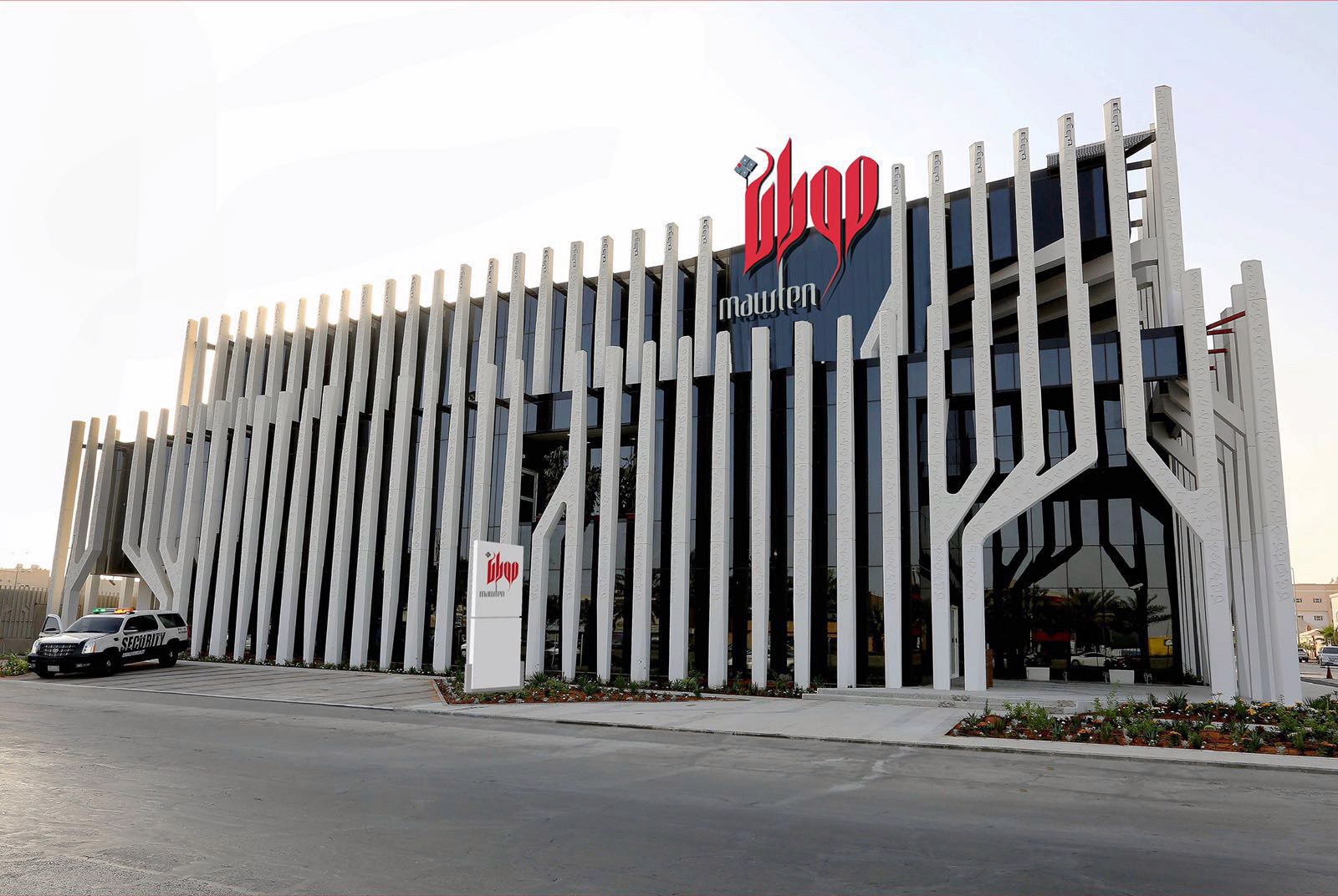
ABOUT THE PRO JECT
Mawten was a strategic identity development project for a major Saudi real estate development company with a paid-up capital of SAR 1.1 billion.
The company was not a small real estate brand looking for a visual refresh. It was an institutional real estate player with development ambition, shareholder confidence, network relations, and the capability to participate in large-scale projects.
The project started by studying the existing brand and redefining the strategic role the new identity needed to carry. Mawten needed a brand expression that could reflect its scale, credibility, Arabic character, urban ambition, and long-term development value.
The goal was not only to create a new logo, but to build a stronger Arabic visual identity system that could support Mawten’s presence across corporate, digital, environmental, and real estate development touchpoints.
THE CHALLENGE
When a major real estate company outgrows its visual expression
Mawten had the scale, capital base, and strategic ambition of a major real estate development company, but its existing visual identity needed to evolve to reflect that level of institutional confidence.
With a paid-up capital of SAR 1.1 billion, Mawten needed a brand identity capable of carrying more serious meanings: development capability, trust, scale, network relations, urban ambition, uniqueness, and elegance.
The analytical challenge was not to criticize the previous identity. It was to ask whether the existing brand expression still matched the company’s size, role, and future direction.
The new identity needed to move Mawten from a familiar visual presence into a more strategic Arabic brand system one that could support major projects, alliance-building, development-led growth, and a stronger real estate market position.
Key challenges included:
Reflecting the scale of a SAR 1.1 billion real estate development company
Evolving the brand beyond its existing visual expression
Communicating experience, network relations, development ambition, uniqueness, and elegance
Building a stronger Arabic identity rooted in culture, structure, and urban growth
Creating an identity system flexible enough for corporate, digital, signage, and environmental applications
Supporting Mawten’s role in larger real estate projects and development-led growth
OUR Strategic APPROACH
BUILDING AN IDENTITY THAT MATCHES THE SCALE OF A MAJOR REAL ESTATE COMPANY
The strategic approach started by treating Mawten as an institutional real estate development brand, not as a standalone logo exercise.
With a capital base of SAR 1.1 billion, Mawten needed a brand identity that could communicate scale, confidence, development capability, and long-term value. The work focused on translating the company’s strategic roles, experience, network relations, development, uniqueness, and elegance into a stronger Arabic and urban visual identity system.
The goal was to create a brand expression that could support Mawten across corporate communication, real estate projects, investor-facing touchpoints, digital presence, and environmental applications.


COMMUNICATION DIRECTION
A STRATEGIC ARABIC IDENTITY FOR A DEVELOPMENT-LED REAL ESTATE BRAND
The brand direction was built around creating a stronger, more institutional identity for Mawten, one that could reflect the scale, ambition, and credibility of a major Saudi real estate company.
Instead of treating the identity as a decorative visual refresh, the direction focused on translating Mawten’s strategic roles into a clear brand language: experience, network relations, development, uniqueness, and elegance. These roles were directly linked to the company’s ability to work on distinctive projects, lead alliances, and contribute to development-led growth.
Visually, the direction moved toward an Arabic, urban, and architectural identity. The Arabic dot became the starting point of the system, while the letterforms evolved into a structured mark that carried cultural meaning, urban ambition, and a more elegant real estate presence.
The result was a brand language designed to feel confident, refined, culturally rooted, and suitable for a company operating at a larger real estate development scale.


INTEGRATED
COMMUNICATION SYSTEM
The identity was developed as a complete brand experience system, not only a logo or visual mark.
Mawten needed a brand system that could work across corporate communication, real estate presentations, digital platforms, environmental branding, signage, and outdoor applications. Each touchpoint had to express the same sense of confidence, Arabic character, urban ambition, and institutional credibility.
The system translated Mawten’s strategic roles, experience, network relations, development, uniqueness, and elegance into a consistent visual language that could support the company’s presence across business, project, and market-facing environments.
Core elements included:
Arabic logo and visual identity system
Corporate stationery and business communication materials
Digital brand presence across tablet and mobile touchpoints
Signage and building facade applications
Outdoor advertising and environmental branding
Abstract Arabic graphic language inspired by the identity mark
Brand applications designed for corporate, project, and real estate communication
Final Outcome
A STRONGER ARABIC IDENTITY FOR A DEVELOPMENT-LED REAL ESTATE COMPANY
The final identity gave Mawten a more confident, distinctive, and development-focused brand presence.
By transforming the Arabic dot and letterforms into a solid visual mark, the identity created a stronger connection between Mawten’s Arabic name, urban ambition, and real estate development role. The result was a brand system that felt more institutional, more memorable, and more aligned with the scale and ambition of a major Saudi real estate company.
The project helped Mawten move from a visual identity into a complete brand experience system one capable of supporting corporate communication, digital presence, signage, environmental applications, and future development-led growth.


